


Sharing is caring!
In the world of marketing, colors are not simply a matter of aesthetics. They play a crucial role in how customers perceive a brand, influence their emotions, and build their loyalty. This article explores how color choices can be used strategically to strengthen customer loyalty.
The Psychology of Colors
Colors play an essential role in the perception of brands and products. They have the power to evoke specific emotions and trigger subconscious reactions in consumers. Understanding color psychology allows merchants to choose the most appropriate shades to strengthen their loyalty strategy and create an emotional connection with their customers.
🔴Red: Urgency and Excitement🔴
Red is a dynamic and energetic color. It is often associated with urgency, passion, and excitement. Red can increase heart rate and create a sense of urgency, making it ideal for promotions and limited-time offers. Within Loyalty Programs, using touches of red to announce flash sales or exclusive offers can prompt customers to act quickly and boost participation.
Use cases:
•
Call-to-action (CTA) buttons for limited offers.
•
Special promotion notifications.
•
Advertising banners for exclusive events.
🔵Blue: Trust and Reliability🔵
Blue is often associated with trust, reliability, and security. It is a calming color that inspires serenity and loyalty. Brands that use blue can reinforce a sense of security and professionalism. For Loyalty Programs, blue can help build a trusting relationship with customers, reassuring them of the brand’s stability and reliability.
Use cases:
•
Backgrounds for loyalty websites and apps.
•
Welcome and thank-you emails.
•
Long-term Loyalty Programs aimed at building trust.
🟢Green: Harmony and Freshness🟢
Green is associated with nature, health, and tranquility. It evokes feelings of calm and renewal. Brands that emphasize sustainability and well-being often use green to reflect these values. In Loyalty Programs, green can be used to promote eco-friendly initiatives or healthy products, creating a positive and responsible brand image.
Use cases:
•
Promotions for eco-friendly or organic products.
•
Communications about sustainability initiatives.
•
Wellness and health themes in loyalty campaigns.
🟡Yellow: Optimism and Energy🟡
Yellow is a bright and cheerful color that symbolizes optimism, energy, and warmth. It can capture attention and spark feelings of happiness and positivity. For Loyalty Programs, yellow can be used to energize communications and create a welcoming, enthusiastic atmosphere.
Use cases:
•
Congratulations and celebration messages.
•
Seasonal or holiday themes.
•
Promotions designed to convey a positive and engaging atmosphere.
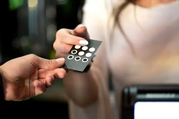
⚫Black: Luxury and Sophistication⚫
Black is often associated with elegance, luxury, and sophistication. It is a powerful color that can convey a sense of prestige and exclusivity. High-end brands frequently use black to project an image of superior quality. In Loyalty Programs, black can reinforce the idea of exclusivity and attract customers seeking premium products and services.
Use cases:
•
VIP Loyalty Cards.
•
Premium reward packaging.
•
Invitations to exclusive events.
Practical Application of Colors in Loyalty Programs
Applying colors in a Loyalty Program goes far beyond aesthetics. Colors can influence customer emotions and behaviors at every touchpoint. Here is how to use them effectively in UI design, communications, and reward packaging.
User Interface Design
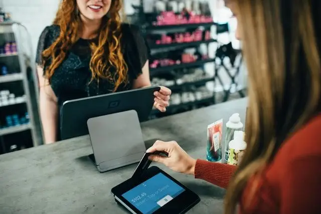
The user interface (UI) of your Loyalty Program — whether a mobile app or a website — must be visually appealing and functional. Colors play a crucial role in guiding users and enhancing the overall experience.
– Call-to-action (CTA) buttons: Using bright, contrasting colors like red or yellow for CTA buttons can capture users attention and drive action. Red, for example, is often used for Sign up or Buy now buttons due to its association with urgency.
– Backgrounds: Page backgrounds should be calming and non-distracting. Shades of blue or green are ideal for providing a pleasant, reassuring visual experience. Blue can build trust, while green can evoke a sense of calm and well-being.
– Brand consistency: Make sure the UI colors align with your brand colors. This reinforces visual identity and helps create a seamless experience for the customer.
Use cases:
•
Red for Claim a reward or Activate an offer buttons.
•
Blue for information sections and calming backgrounds.
•
Green for successful action confirmations or wellness notifications.
Communication and Content
The colors used in communications with your Loyalty Program members are essential for evoking the right emotions and driving action.
– Notification emails: For urgent notifications, such as time-limited offers, red can be used to grab attention and create a sense of urgency.
– Thank-you emails: Using calming colors like blue in thank-you emails can reinforce customer trust and satisfaction. It conveys genuine appreciation and encourages customers to stay loyal.
– Promotional campaigns: For dynamic and upbeat campaigns, incorporating touches of yellow can evoke feelings of joy and enthusiasm, encouraging customers to actively participate.
Use cases:
•
Red for special offer alerts or flash promotions.
•
Blue for welcome emails and thank-you messages.
•
Yellow for seasonal campaigns or special holiday offers.
Reward Packaging and Presentation
The way rewards are packaged and presented can also influence customers perception of their value and their overall satisfaction.
– Luxury packaging: Using premium colors such as black, gold, or silver for exclusive rewards can increase perceived value and make the experience more memorable. Black is often associated with elegance and prestige, while gold and silver evoke wealth and exclusivity.
– Reward personalization: Colors can also be used to personalize rewards based on customer preferences — for example, green packaging for eco-friendly products or pastel shades for wellness items.
– Themed presentations: Creating themed presentations with appropriate colors for special events or seasons can make rewards more attractive and relevant.
Use cases:
•
Black and gold for VIP reward boxes or premium gifts.
•
Green for eco-friendly or sustainable product packaging.
•
Pastels for wellness sets or personal care products.
Case Studies: Color Success in Loyalty
Colors are not just visual elements — they are powerful strategic tools for brands looking to build customer loyalty. Here are two real-world examples of brands that have successfully leveraged colors in their Loyalty Program: Starbucks and Sephora.
Loyalty Program: Starbucks Rewards
Starbucks Loyalty Program, Starbucks Rewards, consistently uses a green color palette to create a unified and engaging customer experience.
– User interface design: The Starbucks Rewards mobile app and website feature shades of green that reinforce the brands visual identity. Key interface elements such as CTA buttons and promotional banners use green tones to attract attention while maintaining a calming atmosphere.
– Loyalty Cards: Physical and digital Loyalty Cards are often green, which not only strengthens the brand but also creates a positive association with Starbucks ecological and sustainable values.
– Communication and content: Starbucks Rewards emails and notifications use touches of green to convey messages of well-being and authenticity. For example, campaigns highlighting eco-friendly initiatives such as discounts for customers who bring their own cups are showcased with green visuals.
Results:
•
Brand consistency: The consistent use of green helps maintain a strong and cohesive brand identity.
•
Customer engagement: Customers associate the color green with positive values, reinforcing their loyalty to the brand.
•
Positive perception: The focus on colors evoking nature and well-being strengthens Starbucks image as a responsible, environmentally conscious company.
Sephora: Luxury, Sophistication, and Exclusivity
Sephora, a leading brand in the beauty industry, uses a sophisticated color palette to create an image of luxury and exclusivity. Black and white — Sephoras primary colors — are a deliberate choice to convey these values.
Loyalty Program: Sephora Beauty Insider
Sephoras Loyalty Program, Sephora Beauty Insider, uses black and white to deliver a premium and elegant experience for its members.
– User interface design: The Sephora Beauty Insider mobile app and website feature a clean, elegant interface with black and white accents. This color combination creates a sophisticated and intuitive user experience.
– Loyalty Cards: Sephoras Loyalty Cards — particularly for the highest tiers (VIB and VIB Rouge) — use black and gold colors to reinforce exclusivity and luxury. These cards serve as a status symbol for customers.
– Communication and content: Sephoras communications, including emails and notifications, primarily use black and white to maintain a luxurious brand image. Exclusive offers and VIP events are often presented with elegant black-and-white visuals, enhanced with gold accents to signal premium value.
Results:
•
Luxury image: The use of black and white reinforces Sephoras image as a high-end beauty brand.
•
Sense of exclusivity: Loyalty Program members feel valued and privileged thanks to elegant and sophisticated visuals.
•
Increased loyalty: The perception of prestige and exclusivity encourages customers to remain loyal and aspire to reach higher tiers of the Loyalty Program.
Conclusion
Color choices play a vital role in how customers perceive and interact with Loyalty Programs. By understanding color psychology and applying it strategically, merchants can create more engaging experiences and strengthen customer loyalty. At Avomark, we are ready to help you harness the power of color to transform your Loyalty Program and build lasting connections with your customers.
—
To learn more: book a meeting with an expert
Also check out our article on moving from a traditional program to an innovative one!